The Shape of Intelligence: Why AI Design Isn’t Just Math
AI creates images in seconds, but meaning takes more. At CREAVA, we explore why future-forward design blends data, emotion, and strategy.

“Emotions can generate. But meaning? That’s still human.”
AI design is no longer sterile or mechanical. It is not cold, and it is not silent logic dressed up in pixels pretending to feel something it cannot. Yet something inside the process is shifting. Something both technical and deeply human.
Artificial intelligence is beginning to create images that seem to feel. Or at least, they look as though they do. We see light that feels like memory, faces that hold quiet tension, and spaces that breathe a calm sense of warmth. These images are not random or accidental. They are learned.

But here is the truth. Emotions cannot be coded. Connection cannot be mapped. Not completely, and certainly not in the way humans understand them. What we are witnessing is not the rise of machine creativity but the emergence of a new kind of intelligence.
This intelligence is shaped by data, patterns, and probability, yet still guided by human intent. It interprets what it is given, but it does not understand the why. That difference is everything. It is the line between simulation and soul.
At CREAVA, we do not see AI as a threat to creativity. We see it as a collaborator, a partner that expands possibility. It helps us move faster, explore deeper, and visualize what once lived only in imagination. But it still needs direction. It still needs the human mind behind the command.

Yes, machines can recognize what serenity looks like. They can replicate the glow of golden hour, trace the curve of a chair, and mimic the tactile rhythm of architectural material. They can reproduce the visual signs of joy, stillness, or tension with near-perfect precision.
But they do not know why any of it matters. They can see form, but not feeling. They can generate, but not care.
Because beauty is not just what is seen. It is what is felt. And felt beauty does not come from speed or efficiency. It does not emerge from flawless rendering or the precision of data. It comes from story. From care. From the subtle decisions only a human eye, guided by emotion, can make.

Design today is no longer just about how something looks. It is about how it lands. It is about how it lingers in the mind and shifts the way someone feels. The role of the designer has evolved from builder to storyteller, from technician to interpreter of meaning.
Even when a design is generated by AI, it is the human intention behind it that gives it depth. When the image works, we do not see the prompt or the code. We feel the purpose within it. We feel the vision that shaped it.
AI can build the structure. It can suggest the surface. It can produce infinite variations. But only we can give those variations meaning. Only we can bring the why.

The future of AI design will not belong to the fastest prompt or the most complex algorithm. It will belong to those who can blend logic with empathy, structure with story, and precision with soul.
Because even in an age of machines, the heart of design remains human. And that is where the future still belongs. With us.
🧠 What Machines Know
AI knows patterns. It studies what we have seen and learns what we have shown it. Over time, it begins to recognize the shapes of beauty that humans have celebrated for centuries. It learns balance, proportion, and light. It knows that symmetry feels stable, that contrast draws the eye, and that a well-framed subject feels intentional.
It understands how beauty has been defined through composition, clarity, and contrast. Feed it a million images, and it will find the thread that connects them all. It learns how to frame, how to center, and how to complete the missing light and shadow. It begins to mimic what a designer’s eye might do without hesitation, whether that vision is bold, minimal, or restrained.

But what it learns is recognition, not understanding. What it creates is output, not intuition.
Machines do not know longing. They cannot feel the quiet pull between nostalgia and future-thinking. They do not understand why a soft blue can comfort a restless mind, or why a vivid red can make the heart beat faster. They do not grasp what tension feels like, or why emptiness can sometimes say more than form.
AI does not know timing. It does not know taste. It only reflects what we have already chosen to love.
And that is where your role begins.

You bring meaning. You bring discernment. You decide what deserves to stay and what must change. You know when an image should whisper instead of shout. You understand when simplicity carries power, and when complexity tells the truth.
AI can replicate what it has seen, but it cannot feel the why behind the work. It does not sense the quiet satisfaction of restraint or the subtle tension that makes an image unforgettable. It cannot understand the emotional weight of a decision made for someone else’s experience.
It can generate structure, but you define substance.
It can imitate craft, but you carry conviction.

Because beauty without intention is just noise. It might attract attention for a moment, but it will not hold it. It does not linger. It does not move.
Connection, however, is different. That still belongs to human hands.
You are the one who decides when a moment feels true. You know when the work finally speaks. You sense when the balance between concept and emotion is right. You are the one who knows when the image stops being a product and starts becoming a story.
The machine can show you infinite possibilities. It can generate what looks like meaning.
But only you can turn those possibilities into purpose.
Because in the end, AI design is not about replacing creativity. It is about reminding us where creativity truly comes from. From attention, from intention, and from the uniquely human need to make something that feels alive.

🧩 The Illusion of Logic-Only Design
AI-generated design can be stunning at first glance. It arrives quickly, polished and complete, as if pulled from the final frame of a campaign. The lines are balanced. The forms are clean. Everything feels confidently composed.
It checks all the boxes we are trained to look for.
Symmetry. Rhythm. Balance. Contrast.
The familiar pillars of visual beauty.
AI has learned them well. It understands how to assemble what looks like good design. But even when every element appears correct, the outcome can feel strangely flat.
The image works, yet it doesn’t land.
It doesn’t linger in memory.
It doesn’t stir emotion.

There is a quiet missing from the piece. A lack of tension or pause. No imperfection to make the work breathe. No small deviation to suggest someone stood behind it, observing, deciding, caring.
This is where AI design enters the uncanny valley.
Not in appearance, but in emotion.
It is a space where everything is technically correct but emotionally distant. Where beauty becomes mechanical. Where rules are followed without context or reason.
You can feel the absence.
The lighting is too even. The layout too balanced. The surfaces are smooth but say nothing. The work functions as visual design, but fails to create connection.
Because while AI can replicate form, it cannot invent feeling.
Design is more than a checklist. It is more than technical skill or mathematical balance. It is about resonance—the space between the object and the person viewing it. That space is emotional, relational, and unmistakably human.

You know when a piece should whisper instead of shine. You sense when a visual should hold back, leave room, or break its own symmetry. These are not decisions made by logic. They are made by instinct.
That is what gives design its soul.
Great design is not generated. It is intuited, unscripted, and felt. It moves like jazz, built on structure but open to variation. Rooted in understanding yet expressed through risk.
It does not just deliver clarity.
It creates feeling.
That is the difference between output and art.
Not how closely it follows the rules,
but how deeply it carries intention.
Emotion cannot be rendered.
But it can be invited.
And that invitation still begins with you.
🧲 Emotion is the Missing Variable
Design is not decoration.
It is storytelling in visual form.
At its best, design does more than communicate. It connects. It does not simply organize space or color or typography. It invites a response. It creates emotional memory.
Because the visuals we remember are not the ones that just impress us with style.
They are the ones that feel like something.
They are tied to memory.
They reflect a mood we once knew.
They stir emotion, even before we process what we are looking at.
This is the difference between visuals that look good and visuals that stay with us.
Style catches the eye. Emotion holds attention.
The most powerful visual experiences create a kind of emotional gravity. They do not just show a scene. They invite the viewer into it. They feel personal, even when crafted for millions. They linger, not because they are perfect, but because they are true.

This is what AI cannot originate.
It can mirror feeling.
It can enhance a tone that you ask it to follow.
But it cannot invent the reason behind the image.
It cannot choose why something matters.
That spark still begins with you.
Aesthetic intelligence is not just about knowing how to make something look good. It is about understanding what the image is trying to say.
What kind of emotion should live inside it.
What kind of moment it is meant to capture.
You are not just feeding the machine keywords and prompts.
You are working with intuition, purpose, and clarity.
You guide the tool, not the other way around. The visual may be rendered by code, but the feeling behind it is yours. The decisions come from your intent. From your sense of timing, taste, and tone.
Emotion is the missing variable.
It is not coded into the software.
It is carried by you.
And when you bring that emotion back into the process,
Design shifts.
It becomes memorable.
It becomes meaningful.
It becomes yours.

🔍 The Designer’s Role Has Changed
Prompting is not button-pushing.
It is not a shortcut, a gimmick, or a passive command. It is not about tossing a few words into a box and hoping something beautiful appears.
Prompting is creative direction in motion.
It is visual storytelling shaped by language, happening at the pace of imagination. It is a brief, an artboard, and a sketch, all condensed into a sentence.
When you write a prompt, you are not typing aimlessly.
You are deciding how an idea becomes visible. You are setting the tone. You are guiding light, color, movement, and emotion before the image even exists.
Every line of input is a micro-strategy.
Every render is a rough draft with potential.
The AI provides options. It delivers variations. It gives you possibilities.

But it does not make the final call.
That is still yours.
You are the one who brings meaning.
You choose what is refined, what is removed, and what is ready to speak. Your job is not just to generate visuals. It is to guide them with vision, voice, and intent.
You are shaping more than style.
You are steering tone.
You are framing emotion.
You are deciding how the work will feel, not just how it will look.
The tools may respond in real time.
But the truth in the image still comes from you.
From your eye.
From your intuition.
From your decisions.
That is what has changed.
We are no longer asking, Does it look good?
We are asking, Does it feel honest? Does it feel human?
In this new era of design, form and feeling must move together.
One without the other is flat, forgettable, unresolved.
Design that only looks good will disappear into the scroll.
Design that feels right will stay with someone.
Because beauty is everywhere now. The tools are faster than ever. The aesthetic bar has been raised.
But meaning?
That still belongs to the one holding the tools.
🎭 Form and Feeling Must Work Together in AI‑Generated Design
AI can generate visuals at astonishing speed.
It can recreate the rules of beauty such as symmetry, lighting, texture, and contrast. It can follow composition guidelines with near mechanical precision.
Yet it does not know why those things matter. It does not understand how a shift in hue can change mood. It cannot sense the emotional difference between restraint and boldness. It cannot choose to create connection.
That part still belongs to you.
As a designer, your task is not to compete with AI. It is to complete it. You bring the nuance, the sensitivity, the story behind the surface. You bring what cannot be coded.

Form and feeling must move together. Design today is no longer only about what looks good. It is about what feels right.
When you pair shape with sentiment, you create visuals that do more than impress. They resonate. They linger. They become memory.
You are not just placing pixels. You are shaping perception. You are building trust, identity, and memory through image and intention.
Want to go deeper?
👉 Read the post: Form Meets Feeling
Explore how emotion, light, and human perspective shape the next evolution of AI‑generated design.
🌱 Why This Matters to Brands
Your audience scrolls fast. Their attention is limited, and every swipe skips a potential story.
Each second becomes a decision.
So what makes someone stop?
It is not just polish. It is not the latest trend or the perfect gradient. And it is never noise. The content that breaks through is the content that feels something.
It creates resonance.
It carries something in the image that reaches out and says, this is for you.
This is where emotional design begins to matter. Not as decoration, but as strategy.
In a feed saturated with visuals, clarity is rare and memorability is priceless. Brands that connect emotionally are not just seen. They are remembered.
Great visuals do more than decorate a layout. They guide the eye. They focus attention. They create emotional context before a single line of copy is ever read.

They are the visual handshake, the first impression that lingers.
AI can help generate those visuals faster than ever. It can build dozens of options, explore direction, and mirror style. But it is still up to the designer to add meaning.
Because speed does not equal substance.
What cuts through is intention. What builds trust is clarity. What drives loyalty is emotional connection. And that still comes from human direction.
Emotional design is not a trend. It is not fluff. It is the future of brand relevance.
Because in an attention economy, feelings are the currency that last.
🌅 Beauty Is Not Disappearing, It Is Evolving
The rise of machines has not erased the value of beauty. It has reshaped the way we understand it.
We have moved from creation to curation, from making every pixel by hand to directing systems that generate in seconds. But this shift has not made design less meaningful. It has made our choices matter more.
What simply looks good is no longer enough. What connects is what feels right.
AI handles repetition. It excels at scale. It refines resolution. It delivers stunning outputs with astonishing speed. But it cannot decide what matters. It cannot define what is true.
That remains our role.
As creators, we are no longer just makers. We are interpreters. Translators. Editors of emotion.
We do not step in just to build from scratch. We step in to guide. To shape what machines give us into something that resonates. Into work that carries weight.
Because real beauty is not just how something looks. It is how it lands.

It’s the difference between an image that holds your attention and one that holds your memory.
It is design with care.
Design that understands rhythm, stillness, and surprise. That knows when to pause. When to soften. When to speak louder through restraint.
True design lives in the space between tool and taste. Between what the machine can produce and what the human can feel. That space is where vision turns into meaning.
Your visuals are not background noise. They are signals. Every image is a first impression, a piece of your voice before a word is spoken. They build trust, invite emotion, and anchor presence in a world that scrolls fast and forgets faster.
And in this new design landscape, your ability to guide beauty, to feel what should stay and why, is more valuable than ever.
Because beauty is not disappearing.
It is evolving.
And your role in shaping it is just beginning.
👉 Read the post: Beauty in the Age of Machines
Explore how aesthetic value continues to lead, even as design becomes faster and smarter.

🧭 Designing at the Edge of Intelligence
Artificial intelligence accelerates the act of making. It streamlines the process, reduces friction, and eliminates delay. With tools like Midjourney, you can generate dozens of visual concepts in just seconds. The output is fast, constant, and seemingly infinite.
But speed is not meaning. And automation is not intention.
The real value of generative tools begins after the generation. The true work starts when the image appears and you, the designer, the creative, the human, decide what stays and what gets reshaped.
This is the edge of intelligence. It is the threshold where machine efficiency ends and human instinct begins.
You are not simply choosing an image because it looks polished. You are selecting a visual that aligns with a specific tone, a design intention, and a story you want to tell. Every detail, from texture to composition to shadow, must serve your emotional goal.
This is not just art direction. This is creative authorship.
AI can sketch the outlines. It can guess the style, mimic the medium, and even fill in what is missing. But it does not feel. It does not intuit. It does not know your client, your audience, or your purpose.
You do.
Only you can recognize when an idea resonates. Only you can adjust a mood board until it carries the right weight. Only you can determine when a visual communicates clarity rather than noise.
That is what it means to design at the edge.
It requires patience to generate, pause, and reflect.
It demands discipline to edit, refine, and reject what is merely pretty but not purposeful.
It takes confidence to let your own vision guide the process rather than letting the tool define the outcome.
This is how great design happens. Not from speed, but from slowness with intention. Not from output, but from emotional precision.
Machines assist. Humans decide.
That edge, between tool and touch, between signal and silence, is where true design lives.
🔗 What Lasts is What Connects
Design trends come and go.
One season, it might be glassmorphism. This is a visual style that uses blurred translucent layers, frosted glass effects, and soft inner glows. The goal is to create a sense of depth, lightness, and modern refinement. It feels minimal, airy, and futuristic. It is often paired with pastel backgrounds and clean typography.


Then the aesthetic shifts again.
Designers begin to embrace digital brutalism. This approach uses harsh typography, raw layout structures, and intentionally jarring user experiences. It rejects polish in favor of clarity and impact. It feels aggressive, unfiltered, and bold.


Later, we may return to flat design, or move toward neubrutalism.
Neubrutalism blends the rawness of brutalism with a more organized structure. It features thick outlines, solid color blocks, and basic HTML-like elements. The tone is unapologetically direct but more restrained than digital brutalism. It often appears simple on the surface but is carefully composed.


Then, just as quickly, the next trend arrives.
Styles evolve. Visual languages shift. But what stays consistent is the need to communicate with clarity and emotion.
Styles evolve. Palettes change. Motion becomes stillness, and then starts moving again.
But through it all, some things remain. Some things outlast the algorithm. What stays with people is connection.
Connection is the invisible thread that draws someone in and makes them stay. It lives in honesty. It lives in tone of voice. It lives in the subtle, intentional choices that feel real rather than just clever.
Connection is not a gimmick. It is not a flashy graphic or a clickbait headline. It is texture, warmth, and a quiet sense that someone has considered the viewer’s experience.
People remember what feels true. They return to what offers meaning rather than just noise. They follow stories that resonate, not just visuals that impress for a moment.
The best design does more than look good. It holds emotional weight. It creates a pause. It offers a moment that is worth remembering.
Design that connects does not chase what is trending. It stands for something.
It is anchored by purpose, not popularity.
It is shaped by curiosity, restraint, and clarity, not by aesthetics alone.
Design that connects does not scream for attention. It earns trust. It builds belonging. It creates a space where the viewer can feel something, even if they cannot explain what or why.
That is what lasts.
Not the style.
Not the filter.
Not the font.
The feeling.
And if you can design from that place, a place of emotion, care, and intention, your work will not just be seen. It will be remembered.
🔄 Beyond Tools: Why Creative Direction Still Matters
In a time when artificial intelligence can generate a hundred visual options in seconds, it’s natural to wonder about your place in the process. You might begin to ask yourself what role the creative still plays. If machines can deliver output so efficiently, what value remains in the human touch?
The answer is not only clear.
It is essential.
Your value is everything the machine cannot offer.
AI excels at generating volume. But it does not understand nuance, emotion, or cultural timing. It cannot identify what feels authentic or when something resonates beyond the surface. Your role is not just to produce. Your role is to synthesize. You connect ideas the algorithm cannot perceive. You bring context, sensitivity, and intention to the work.

You don’t simply input prompts. You shape them. You guide the process with a sense of what matters and why. You evaluate results not only for polish but for purpose. When something doesn’t align, you don’t just adjust. You rethink the approach entirely.
Creative direction isn’t about controlling every detail. It is about leading with a clear vision and a grounded sense of what works. It means knowing when to refine and when to strip things back. It means shaping not just how something looks, but why it needs to exist at all.
When clients search for someone skilled in tools like Midjourney, they are not only seeking technical ability. They are investing in your judgment, in your ability to distinguish noise from meaning. They are trusting your eye, your taste, and your capacity to take raw output and turn it into something refined, thoughtful, and lasting.
Anyone can generate.
Few can curate.
Even fewer can lead.
A good visual might capture attention for a moment.
A strategic visual earns trust. It supports a message. It reflects the voice of a brand. It helps people feel something they remember, even if they can’t explain why.
That is where creative direction lives.
It lives not in the tool, but in the decisions that surround it. In the ability to shape what matters. In the perspective that knows how to guide a process, not just push it forward.
You are not being replaced.
You are being repositioned.
And your perspective matters more than ever.
🎯 Using Emotional Awareness to Shape Outputs
Design is not just about what looks good.
It is about what feels right.
It is about intention, connection, and care.
When emotion enters the creative process, design begins to breathe.
A good image becomes a moment. A simple shape turns into a symbol. The work starts to mean something beyond color and form.
This is the strength of emotional awareness. It turns visuals into experiences that stay with people. It adds depth, it builds trust, and it creates a feeling that lingers long after the first glance.

✨ What Emotional Awareness Looks Like in Practice
It begins with how you choose your references.
You do not collect images simply because they are beautiful. You select them because they carry story. You look for tone, mood, and context. The right reference does more than impress. It invites the viewer into a narrative. It helps them sense what you are trying to say before a single word appears.
Then there is light.
You guide lighting not only for precision, but for atmosphere. You decide where warmth belongs and where tension should live. You use brightness to open emotion and shadow to suggest quiet. Each choice communicates something. Each adjustment moves the viewer closer to feeling.
Revising becomes a different act too.
You do not revise to chase perfection. You revise to find clarity.
Every change brings you closer to the truth of the message. You are not polishing for approval. You are searching for honesty.
This is where design becomes emotional language.
It listens.
It responds.
It speaks with care and restraint.

Midjourney and similar tools are powerful. They can generate thousands of possibilities in moments. Yet they cannot sense the quiet difference between relevance and resonance. They cannot feel the subtle shift between something that pleases the eye and something that moves the heart.
In the hands of a thoughtful designer, a tool becomes more than efficient. It becomes purposeful. It becomes a way to turn emotion into form and to let imagination take shape through feeling.
The goal is not only to create.
The goal is to connect.
And emotional awareness is how you get there.

🛠️ Your AI Toolkit Isn’t Complete Without Intention
Let’s be clear.
A tool doesn’t replace instinct. A prompt doesn’t replace perspective.
Design still demands taste. It still demands vision. It still demands you.
The more accessible AI becomes, the more valuable human clarity will be. Because when everyone has the same tools, what sets you apart is how you use them.
Anyone can generate. But not everyone can guide. Not everyone can lead a visual with purpose. That’s where your creative intelligence shines.
The tool is only the beginning. Your intention is what gives it direction.
Design driven by emotion, not just automation, leaves a lasting mark. It speaks louder. It stays longer. It invites trust.
💡 Emotion gives design purpose. It carries meaning beyond the prompt.
👉 Read the post: Designing Emotion
Explore how empathy, not just aesthetics, separates design that resonates from design that fades.

🧠 Trust Is Earned Through Process, Not Just Outputs
In a world where anyone can prompt, process is what sets true professionals apart.
Clients are no longer impressed by visuals alone. They want to know how you got there. They value the thinking, the structure, and the intention behind the work.
The path matters as much as the result.
⚙️ Behind every compelling image, there is a creative who does more than just generate. They interpret feedback with clarity. They refine with care. They balance aesthetic choices with business goals.
They know when to simplify and when to push boundaries.
Designers who collaborate with AI are not just producers. They are translators. They translate tone into texture, vision into visual, and ambiguity into action.
Speed might open the door. But trust is what earns the seat at the table.
🧩 In a world flooded with instant visuals, your process becomes your product.
Clients return for more than outcomes. They return for how you think. They return for how you listen, how you lead, and how you turn abstract ideas into impactful experiences.
That’s the value no prompt can replicate.

🧭 The Missing Layer: Visual Context in a Fragmented World
In the scroll era, attention is a luxury.
People don’t pause for pretty anymore. They pause for relevance. They stop when something speaks directly to them, not just when it looks good.
That’s why the strongest visuals today do more than just show. They situate. They belong to something larger than the frame. They live inside a moment, a message, or a mission.
When you embed design into context, everything shifts.
A single image becomes a story anchor. It becomes part of a campaign. It aligns with a product, a message, or a movement. It doesn’t float alone. It connects.
📌 Ask before you prompt:
- Where does this visual live?
- What conversation does it join?
- How does it move people from awareness to meaning?
These questions sharpen your intent. They turn prompting into purpose.
Midjourney can generate thousands of images. But context is what turns those images into narratives. Into signals. Into something that lasts.
Visuals without context are decoration. Visuals with context become memory.

🔄 From Aesthetic Output to Strategic Assets
Let’s redefine what good design means in the age of AI.
It’s no longer just about visual polish. Clean gradients and cinematic lighting are no longer enough.
Today, good design serves a purpose. It delivers functional beauty. It earns its place by working harder, communicating clearer, and supporting strategy from the ground up.
When brands invest in visuals, they’re looking for more than aesthetics. They want systems that scale. They want design that adapts.
They are asking for:
- Art direction that performs across digital touchpoints
- Style cohesion that reinforces brand identity
- Imagery that translates from hero banners to product stories
- Visuals that sell emotion, not just features
Midjourney gives you speed. It gives you options. But without structure, those images are just content.
You bring the system. You bring the logic, the layers, and the long-term thinking.
That’s where real creative direction lives.
When every image becomes an asset, built with purpose, aligned with strategy, and shaped with intention, design stops being just visual.
It becomes valuable.

🧬 The Emotional Architecture of Modern Design
What separates noise from resonance?
Structure.
Even in a fluid, fast-scrolling world, people still respond to form. They notice rhythm. They feel emotional order, even if they can’t describe it.
That’s why great AI visuals are not created at random. They are shaped with intention. They are built to direct the eye, carry emotional weight, and establish tone.
Design without structure feels passive. Design with emotional architecture feels alive.
🌀 The most effective visual designs often include:
Visual gravity, what the eye lands on first
Emotional pacing, the tempo of color, composition, and contrast
Focal intent, guiding the viewer’s gaze with purpose
These are not just design principles. They are emotional tools. They help shape meaning. They influence how someone feels in the first second and whether they stay for the next.
Midjourney gives you options. It gives you speed and variety. But emotional architecture gives your work structure. It is what turns raw visuals into purposeful design.
It is the difference between something that is simply pretty and something that is unforgettable.

🔐 Ownership in the Age of AI: What Still Belongs to You
Here’s the truth many avoid.
AI will make it easier to generate visuals. It will reduce friction, speed up production, and offer an endless stream of options. But it will not make it easier to stand out.
And it will never make your taste... yours.
That is something AI cannot replicate. It can suggest. It can remix. But it cannot decide what feels right for your audience, your brand, or your values.
Ownership now lives in the intangibles. It lives in:
- Your taste, your ability to choose what fits
- Your judgment, knowing when to go subtle and when to go bold
- Your standards, the line you draw between almost right and exactly right
📣 In a world of visual overload, your point of view becomes your competitive edge.
That is the moat around your brand. That is what clients come for.
Not just your results. Not just the images you can generate.
They come for your eye. They come for your discernment. They come for your ability to lead creative work with clarity and intention.
Because in the age of AI, your voice is the only thing that cannot be automated.

🚀 Reframed: Visual Strategy Meets Storytelling
Let’s move from theory to practice.
If you are working with AI-generated visuals, your job is no longer just about output. It is about outcome. It is about creating impact, not just completing tasks.
That shift changes everything.
Every visual you create must do more than look good. It must:
- Tell a story that sticks
- Support a message that matters
- Build a presence people want to follow
You are not just delivering images. You are delivering intention. You are translating emotion into pixels.
When visuals carry feeling, they create memory. They shape perception. They move people.
That is the evolution of creative work in the age of AI.
It is not about how many images you can produce. It is about what they say, how they feel, and why they matter.
Strategy meets storytelling at the point where form serves meaning. That is where visual leadership lives. That is where you bring the difference.

🔍 Beyond Tools: Rethinking the Role of the Creative Director
It’s easy to wonder.
If the artwork is ready in seconds, what else is there to do?
The answer is everything.
Anyone can access AI. Anyone can type a prompt. Anyone can download a folder full of polished images.
But if the creative intent isn’t guiding the process, the result is just decoration. Pretty pieces, disconnected from purpose.
You are not just assembling visuals. You are building meaning. You are shaping narratives, defining tone, and making choices with impact in mind.
Midjourney doesn’t understand your audience. It doesn’t know the goal of the campaign or the soul of the brand.
You do.
Through visual direction, you decide what matters. You define structure, hierarchy, contrast, and mood. You are the one who gives form its reason.
That’s the real difference.
Creating something that gets seen is one thing. Creating something that gets remembered is something else entirely.
And that’s where you lead.

🧠 Applying Emotional Intelligence to Midjourney
When used well, AI becomes more than just a tool. It becomes a lens.
But that lens is only as clear as the emotion behind it. Without emotional clarity, the image is hollow. With it, the image becomes felt.
🎯 A deeply emotional visual brand does more than look good. It:
- Aligns with the audience’s mindset
- Shapes mood and sets expectation
- Reflects values before a single word is spoken
This is where creative direction meets emotional intelligence.
A prompt can describe how something should look. But only you can guide why it should exist. Only you can ensure it feels right, not just looks right.
Because expression without empathy is output.
Expression with empathy is design.
And design rooted in empathy doesn’t just speak. It resonates.

🛠️ Your Midjourney Workflow Needs More Than Tools
Let’s be clear.
A library of textures, styles, or assets doesn’t create a high-impact project on its own. Volume is not vision.
Midjourney won’t anticipate your deadline. It won’t balance nuance and need. It doesn’t know which design direction supports your strategy unless you lead it there.
You are still the creative compass. You bring alignment. You decide what matters.
The outcome only resonates if it begins with purpose. Without clear intent, even the most beautiful visuals feel empty.
So what makes a real Midjourney toolkit?
It’s not about how many prompts you can write. It’s not about how many images you can generate.
It’s about knowing what’s worth making.
It’s about focus. Taste. Timing. Judgment.
That’s what transforms your workflow from reactive to intentional. That’s what makes your work stand out in a space filled with sameness.
The tool is powerful. But without clarity, it’s just output.
With clarity, it becomes impact.

🧩 What Clients Actually Want from AI-Elevated Design
Speed matters. That’s a given.
But today’s clients are not just asking for faster results. They are asking for meaningful ones.
They want more than volume. They want vision.
Clients look for designers who know how to harness tools like Midjourney without losing the soul of the work.
They want AI to support creativity, not replace it. They want automation with intention. They want style with substance.
✅ What they actually care about:
- Will this visual feel true to the brand?
- Will it resonate across different audiences and touchpoints?
- Will it connect emotionally without compromising clarity or voice?
They want the beauty Midjourney can offer. The richness of texture. The cinematic tone. The polished surface.
But not at the cost of message. Not at the cost of meaning. Not if it sacrifices identity.
Because at the end of the day, clients remember the work that connects.
Not just the work that gets done fast.

💬 Final Thought
AI will keep evolving.
It will get faster. Smarter. More precise.
But resonance? That still belongs to us.
The future of design won’t be ruled by logic alone. It will be shaped by clarity, connection, and human intent.
Even in a world oversaturated with visuals, your taste still leads. Your intention still lands. Your message still matters.
So make visuals that carry meaning. Make them feel as much as they function.
Because design is no longer just what you make.
It is what moves people.
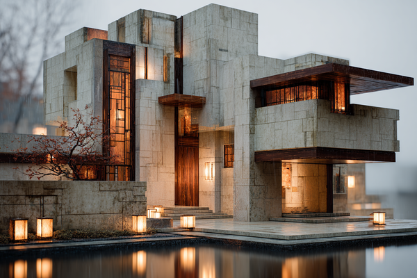
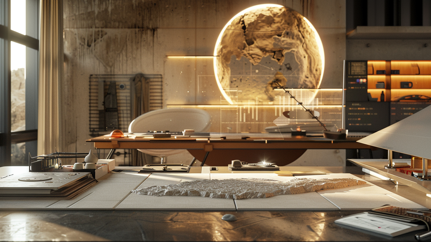
🖼 Featured Visual: Where Precision Meets Purpose
The architectural rendering below was created using Midjourney AI. It merges algorithmic precision with artistic intent to explore the evolving language of AI-driven design and human-led storytelling.
📣 Ready to Shape Visuals That Feel as Good as They Look?
Let’s turn Midjourney into more than just beautiful outputs. Let’s build visuals that resonate.
I create emotionally intelligent, story-driven visuals. From strategic moodboards to architectural concepts, every piece is crafted with clarity, precision, and purpose.
Whether you're a brand strategist, creative director, or founder, your goal isn’t just attention. Your goal is memory. Your audience should feel something and remember why they came.
✨ On My Fiverr Profile, You’ll Find:
🎨 Fashion, UI/UX, and Concept Moodboards
Stylish and strategic boards that capture your brand’s visual voice with clarity and depth.
🏡 Midjourney Interior Design Renders
Visually rich interiors designed with editorial balance, texture, and warmth.
Great interiors do more than fill a space.
They tell a story through material, mood, and light. Each render is crafted with an eye for editorial sensibility, where every texture serves a purpose and every color has intention. These are not generic AI outputs. They are carefully directed compositions that reflect lifestyle, tone, and emotional atmosphere.
With Midjourney, interiors can feel polished without feeling cold. You can build depth, softness, and natural rhythm into the frame. Think of linen drapes catching light, a worn leather chair that suggests memory, or an afternoon shadow that softens the space.
This is not just interior design.
It is interior storytelling.
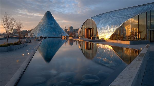
🏗️ Architectural Visuals and Concept Renders
Clean, modern perspectives that combine emotional tone with spatial clarity.
Architecture is structure, but it is also feeling.
It’s the way a space holds light. It’s the tension between lines, the contrast between concrete and glass, the calm of repetition. These renders prioritize clarity, scale, and form, while layering in subtle emotional tone.
Each visual is composed with a modern sensibility — minimal but not empty, clean but not sterile. Whether it's a concept for a public pavilion or a residential retreat tucked into nature, the goal is always the same: to make people feel something when they look.
With the right creative direction, Midjourney becomes more than a tool for generating ideas. It becomes a partner in expressing architectural intention.
📚 Whimsical Book Covers and Children’s Illustrations
Narrative-driven visuals that are vibrant, expressive, and pitch-ready.
A good children’s illustration holds a spark.
A great one tells a story before the first word is read.
Each image in this series is built with imagination, character, and emotional energy at its core. These covers and scenes are not just visually rich. They are alive with movement and meaning.
Whether it is a shy dragon peeking from behind a castle wall or a forest glowing in unexpected colors, the work invites children into a world they want to return to. Each image is designed to feel publishable, pitch-ready, and full of possibility. The visuals balance charm with clarity and whimsy with precision.
The result is a visual story that speaks to both the child and the adult turning the page beside them.
👗 AI Moodboards & Fashion Concepts
Visual direction designed for fashion styling, brand identity, creative concepting, and early-stage UI/UX inspiration.
Every strong creative process begins with a sense of direction.
In fashion, that direction is visual. It is tone. It is feeling.
AI-powered moodboards give that direction a voice. They are more than simple aesthetic snapshots. They help you see your story before it takes form. Whether you are styling an editorial shoot, designing a new collection, or mapping the visual framework of a digital product, these moodboards serve as a creative compass that points your team toward clarity.
Each board is built with intention. Every image is chosen for its mood, texture, and emotion. You might be defining the atmosphere for a luxury streetwear launch, setting a color direction for a minimalist fashion brand, or creating concept visuals for a startup app interface. Whatever the goal, these compositions create structure without confinement and cohesion without constraint.
They are built to guide.
To align teams.
To move ideas forward with focus and confidence.
The process is collaborative from start to finish. Using thoughtful prompts, relevant references, and creative cues, Midjourney can produce editorial-quality fashion concepts with remarkable speed. Yet what makes these visuals meaningful is not how quickly they are generated, but how intentionally they are shaped.
Each image is refined through direction, context, and aesthetic understanding. It is the combination of technology and creative judgment that transforms output into art direction.
These visuals do more than fill a deck or presentation.
They anchor your vision.
They give your team something to believe in and build from.
If you are ready to define your aesthetic with clarity, emotion, and style, this is where it begins.
Your next creative direction starts here.
🧠 Creative Direction with Midjourney AI
Fast, intentional design support aligned with your goals, not just what’s trending.
Midjourney can generate quickly.
But without direction, it often creates noise instead of meaning.
This service is grounded in creative strategy, not in chasing aesthetics for their own sake. Each visual is shaped by your objectives, your brand values, and your emotional intent. The goal is not to follow the feed. The goal is to create something that feels right for you.
You don’t receive a random gallery of images.
You receive a curated selection of visuals, refined through intentional prompts, thoughtful lighting choices, aligned references, and careful style direction. Every piece is designed with clarity, tone, and purpose in mind.
AI alone is fast.
But with the right guidance, it becomes a tool for vision-driven design.
Your ideas remain at the center.
And your perspective shapes every decision that follows.
⭐ Why Clients Return
- Rated 4.9+ by satisfied clients
- Known for strategic thinking, refined results, and clear communication
- Trusted to turn concepts into visuals that last beyond the scroll
📍 Let’s Create Work That Lasts
Not just in timelines, but in minds.
The most memorable creative work does not just meet a deadline.
It leaves an impression.
It resonates beyond the moment and becomes part of how people remember, connect, and respond.
Design should not be disposable.
It should carry meaning.
Whether you are crafting a brand identity, building a story, or exploring AI-powered visuals, the work should reflect who you are and what you care about.
This is where intentional design begins. With visuals shaped by clarity, emotional tone, and creative direction. With decisions that reflect purpose, not passing trends. With visuals that do more than impress. They invite. They express. They last.
You are not just looking for fast results.
You are looking for something that feels right and supports your goals.
You are looking for work that connects.
If you are ready to create images that hold meaning, start here.
Explore My Fiverr Profile to begin your next visual story.
Together, we can create work people remember.